
Drago Social Creative
A lot more Drago. Our identity. A little less predictable.
An internally-directed visual exploration of Drago Studio’s own identity. Instagram posts and stories with expressive type, unexpected cutouts and an unmistakable orange thread.
DRAGO STUDIO / SELF-PROMOTIONAL CREATIVE — NOT COMMISSIONED CLIENT WORK
 Drago Studio
We craft content
that Stand Out !!
 Drago Studio
Have a creative idea?
We will Execute !!
 Drago Studio
Want to look cool?
INSTAGRAM POSTS / 4:5 / COMPLETE COMPOSITIONS
Three expressions. One studio signature.
THE CREATIVE CONTEXT
When the studio is the subject.
A SELF-DIRECTED EXPLORATION
This work gives Drago’s own voice a visual space: confident, playful and comfortable with the unexpected. The studio’s name and palette hold the series together while each frame takes a different route.
READING THE VISUAL DECISIONS
Look closer at how type, image and graphic gestures create contrast. Across posts and stories, the subject and composition can change while the studio’s identity stays recognisable.
READING THE DESIGN / UP CLOSE
Clear anchors.
Unexpected company.
Have a creative idea?
We will Execute !!
01 / EXPRESSIVE TYPE
A straight line, then a change of tone.
Clean, oversized sans-serif copy meets orange italic emphasis. The contrast gives the words a punchline without needing every line to shout.
02 / UNEXPECTED CUTOUTS
A familiar subject. An unfamiliar role.
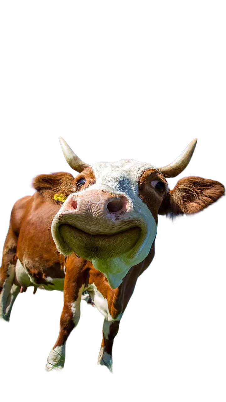
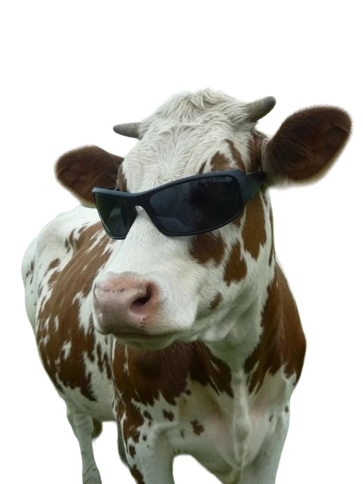
The playful cow imagery interrupts an otherwise clean composition. Scale, cropping and sunglasses bring personality, while the paper field gives the subject room.
SAME ATTITUDE / ANOTHER FORMAT
The story continues. The frame changes.
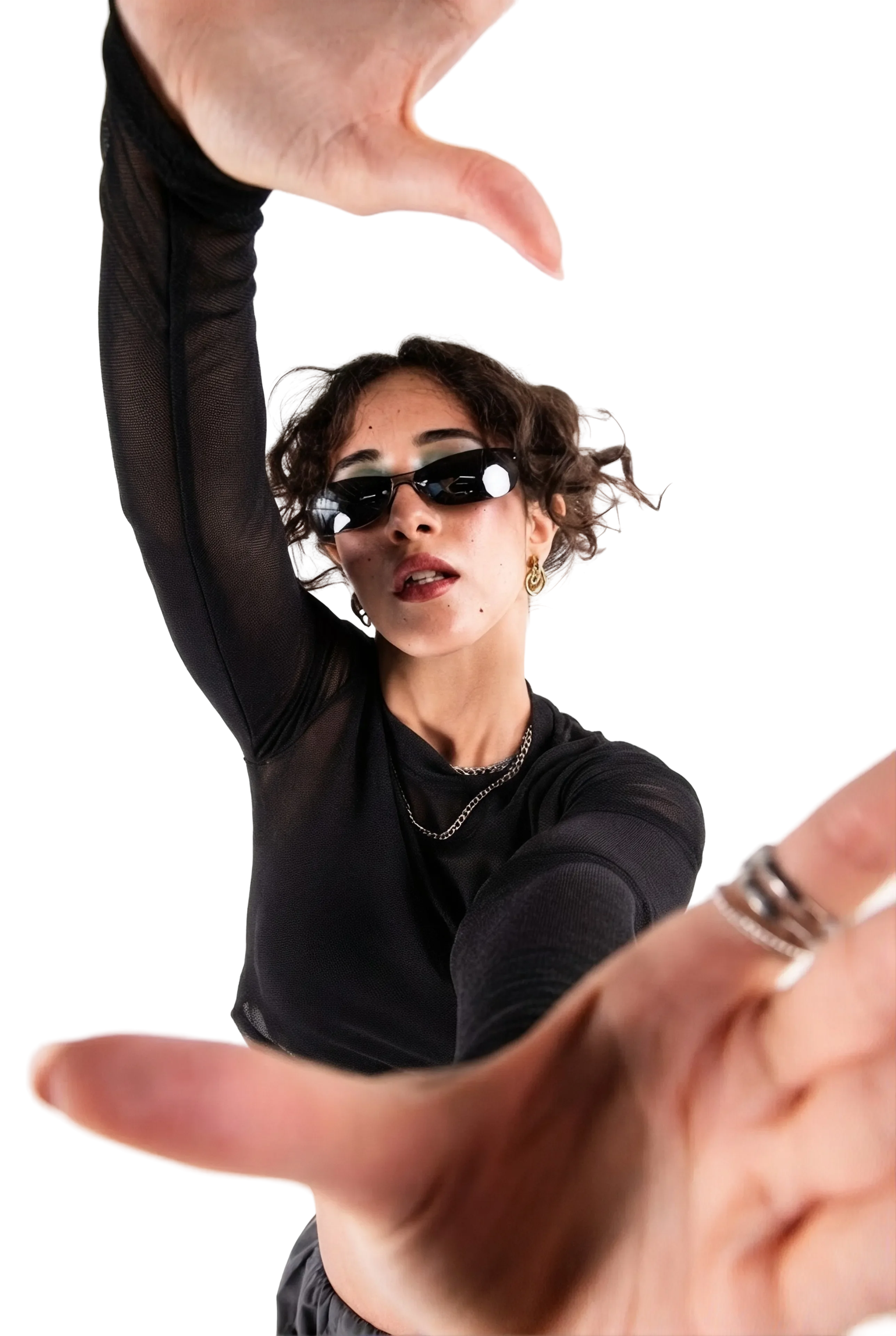
The portrait format gives cutout figures and orange gestures more room to move across the composition. Each story remains recognisably part of the same visual world.


INSTAGRAM STORIES / 9:16 / COMPLETE COMPOSITIONS
Artwork portraits—not Drago team photographs.
03 / THE RECOGNISABLE THREAD
Not identical.
Still connected.
Orange works as a field in the first post, a typographic accent through the series and a bold graphic gesture in the stories. The repeated signature and restrained paper-and-ink palette provide continuity across 4:5 and 9:16 formats.
Logo
A recurring studio signature.
Palette
Orange, paper and ink.
Composition
Room for type and a strong focal point.
THE CREATIVE TAKEAWAY
Consistency doesn’t have to mean repetition. A few clear anchors leave plenty of room for character.
MORE FROM THE STUDIO / UIUX
A different brief.
Less busywork. A clearer product story.
A website design for an AI-agent product built around sales teams. A clearer way to communicate what acts, what changes and who stays in control.
Explore Vantage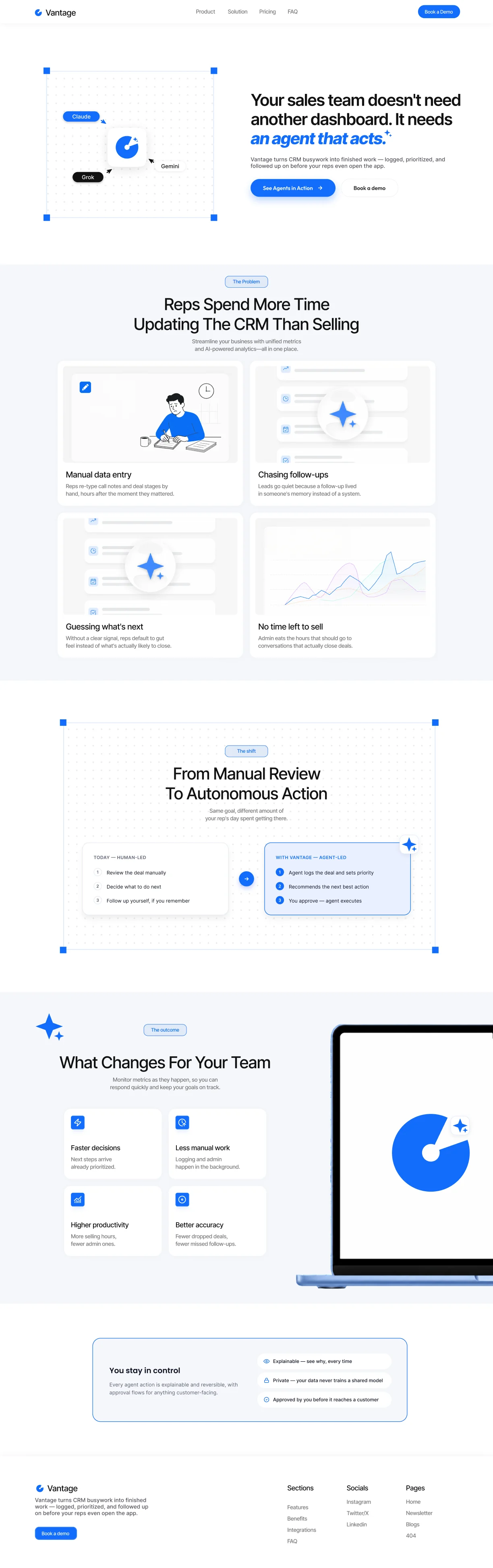
LET’S MAKE SOMETHING
Your next idea.
Our next conversation.
One focused creative project or a broader brand partnership. Tell our team what you have in mind.
Start a project